A logo can be one of the most important investments a company can make. A logo is the company’s visual communication, the link on all of your branding and a great identifier to the public, whether it delivers products or services. Whether you are trying to design a logo or briefing a design team, the following should be taken into account to ensure that your logo will help your company stand out from the crowd and enable you to build a successful brand.
Ask yourself the following questions:-
Who are you?
What does your business do?
Who is your target audience?
Think from the perspective of the person/company you are aiming to provide services/products to instead of personal preferences.
What type of logo is right for you?
Will you be using a typographical logo, iconic logo or a combination of both?
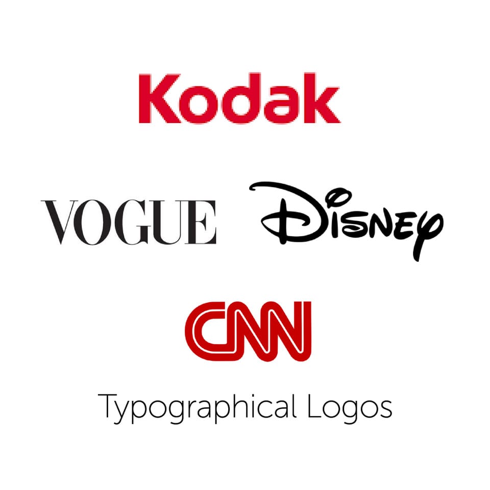
Typographical

When using a typographical logo, try to steer clear of mundane fonts such as Arial or Times.
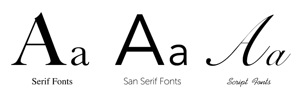
Serif fonts give an impression of an established, respectable, trustworthy company. This is perfect for formal industries such as finance, education, law and medical. The overall appearance of the font is grand which also lends itself to work well for high-end fashion brands.
San serif fonts give an impression of clean, modern and engaging. They have crisp clean lines which do not distract. Ideal for technology, fashion, sport and services.
Script fonts give an impression of elegance, creativity and add a personal touch. However choosing the correct script font can be tricky as many of these fonts can be difficult to read. The right script font can work well and can be combined with a san serif to convey modern and personal. Script fonts work well for food and beverage, restaurants and luxury goods.

Iconic
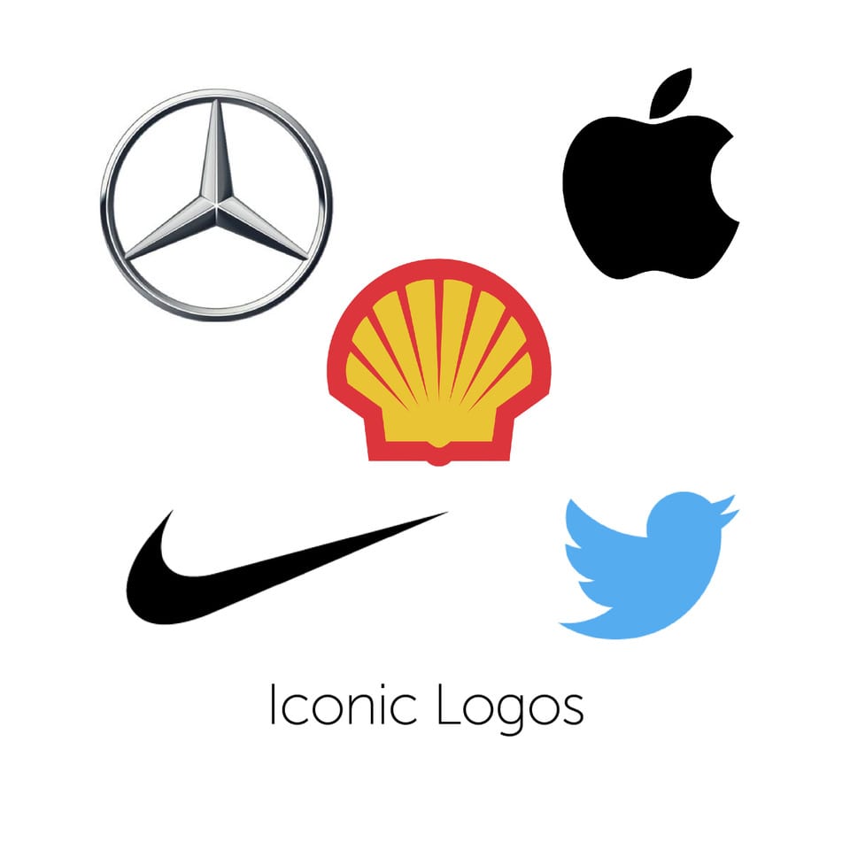
An iconic logo is essentially an emblem that displays your business instead of text, which is easily recognisable and legitimises the product or service.
In order to design the perfect iconic logo, the following should be taken into consideration.
Keep it simple. A cluttered logo with too many elements will distract from your brand instead of enhancing it. Just remember, even if you think it looks boring, will adding another colour or element enhance the brand message in any way? Think Nike, think Apple. Simple, timeless, EFFECTIVE.
Keep it appropriate. A logo does not need to demonstrate what the company does, it must work for its use and audience and what they want to convey. Pepsi is a smiling face not a glass (you are happy that you drank it, Pepsi makes you happy). However the McDonald’s Golden Arch is from their M but it does not show a burger, it is appropriate to the company and it makes it identifiable.

Keep it Versatile.
Another good reason not to over complicate your logo design is to keep it versatile. Your logo should be identifiable as a thumbnail or on a billboard (full scalable). Your logo should stand out in black and white as it does in colour. Your logo should also be flexible enough to be used across all media platforms, think favicons and social media.
Keep it timeless. Don’t follow design trends or your logo will date. If you have to update your logo every few years, it is going to lose impact and effectiveness in the marketplace. Try to design with one dominant colour and a secondary colour if needed.
Combination of both
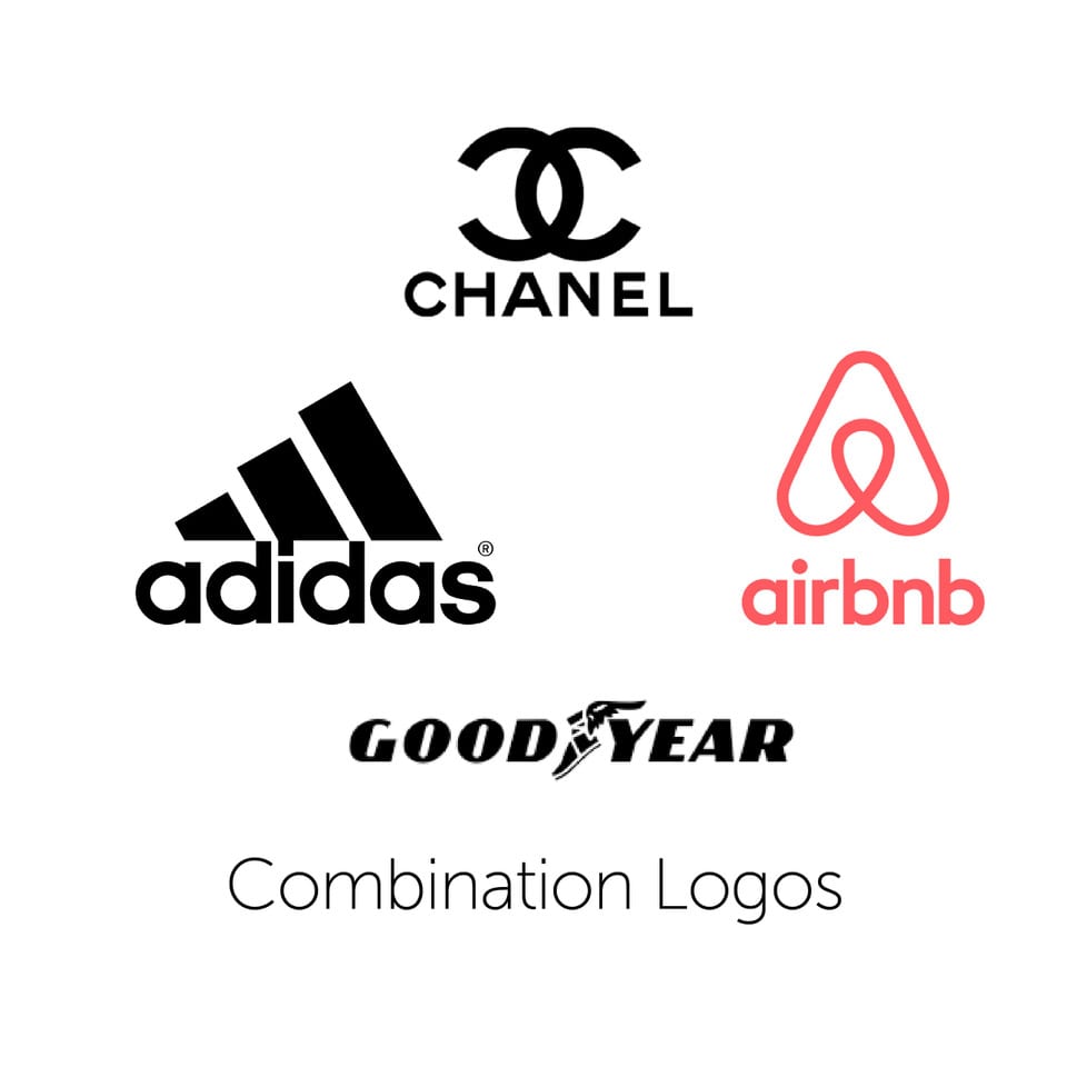
The iconic method is a brilliant way of ensuring your brand is recognisable across all platforms, however if you are a new business starting out, your logo is not going to mean much if people don’t know who you are. We therefore suggest that you use a combination of both until your brand is easily identifiable by the icon alone. We all know the Nike swoosh but you would not identify Nike with that swoosh had they not had the combination at first.

We hope that this article has been helpful. Many companies do give their branding an overhaul, it may just be the case of simplifying what you have to make your business stand out.

