It is a scientific fact that colour is crucial to composition. Colour influences us on a daily basis, which can affect not only how we dress and eat, but also our consumer habits. Colour can inform you; you wouldn’t want to eat a mouldy green piece of bread, but you would consider a succulent red apple or bright yellow banana.
Did you notice that we mentioned a bright yellow banana? As colour fades or becomes tainted, so does the appeal.
Colour is energy. Therefore, when we are using colour we need to think about possible impressions and reactions it will have on our target audience. Visual sense is the strongest and the most developed sense in most humans. It has also been proven that people try or buy with their eyes.
Social Media
As the world has turned to social media, let us have a look at colour and how it is used across various social media platforms.
We all know the trademark blues of Twitter, Facebook and LinkedIn. The colour blue conveys intellect and communication, which is why it is so widely used across social media platforms.
YouTube, on the other hand, has gone the red route. Red denotes passion and excitement.
Instagram, however, has a logo that has a combination of pinks, purple and orange.
This is because Instagram’s Head of Design, Ian Spalter, wanted to bring the design more in line with the aesthetics of the app’s users. Simply put, Spalter states that the app logo is a “colourful doorway”. He continues by saying that, “once inside the app, we believe the colour should come directly from the community’s photos and videos”. Instagram’s logo was changed in 2016 to better work with colour psychology.
Let’s have a closer look at the big brands and their dominant brand colours.
Black & White / Grey
Seen as: Credible / Strong / Powerful / Professional / Elegant
Industry: Corporate / Cosmetics / Construction / Financial / Mining / Marketing / Retail
Feels: Expensive / Premium
Examples: M&S / Nike / Adidas / Apple / Mercedes Benz
Green
Seen as: Natural / Ecological / Growth / Harmony / Education / Organic / Adventurous
Industry: Science / Government / Tourism / Human Resources / Health & Fitness / Medical
Feels: Safe / Stable / Reliable
Examples: Nuffield Health / BP / Specsavers / Viridor / Land Rover / Lloyds Bank
Blue
Seen as: Intellectual / Professional / Calming / Focused / Clean / Judicial / Responsible
Industry: Medical / Judicial / Government / legal / Corporate / Recruitment / Science / Financial / Tradesman
Feels: Trustworthy / Calming
Examples: HP / Oral B / Pfizer / NHS / American Express / Ford / Barclays
Purple
Seen as: Creative / Wise / Inspirational / Compassion / Spiritual / Luxury / Royalty
Industry: Humanitarian / Religion / Retail
Feels: regal / luxurious / spiritual
Examples: BanQ / Cadbury / Fedex / Yahoo / Hallmark / Zoopla / Syfy
Red
Seen as: Energy / Urgency / Passion / Excitement / Heat / Attention
Industry: Entertainment / Food / Sport / Fire Protection / Children’s Products / Travel
Feels: Exciting / Emotional
Examples: Nintendo / Kelloggs / Coca-Cola / Virgin / Avis / Lego
Orange
Seen as: Stimulate / Communicate Fun / Draw Attention / Express Freedom / Fascinate
Industry: Art / Entertainment / Food / Sports / Transportation
Feels: Optimistic / Fun / Adventurous
Examples: Nickelodeon / TNT / GSK / B&Q / Fanta / Timberland / Amazon
Yellow
Seen as: Fresh / Happiness / Positivity / Clarity / Energy / Optimism / Intellect / Honour / loyalty
Industry: Food / Sports / Transportation / Travel / Leisure
Feels: Energetic / Cheerful
Examples: McDonalds / Shell / Ferrari / Subway / Nikon / Lufthansa
Colour Combinations
A logo does not need to be a single colour (as you can see from some of the examples above).
Colour palettes also play an important in how attractive or engaging a logo or brand can be. Psychologist Angela Wright developed the Colour Affects system and how they can help appeal to your target audience.

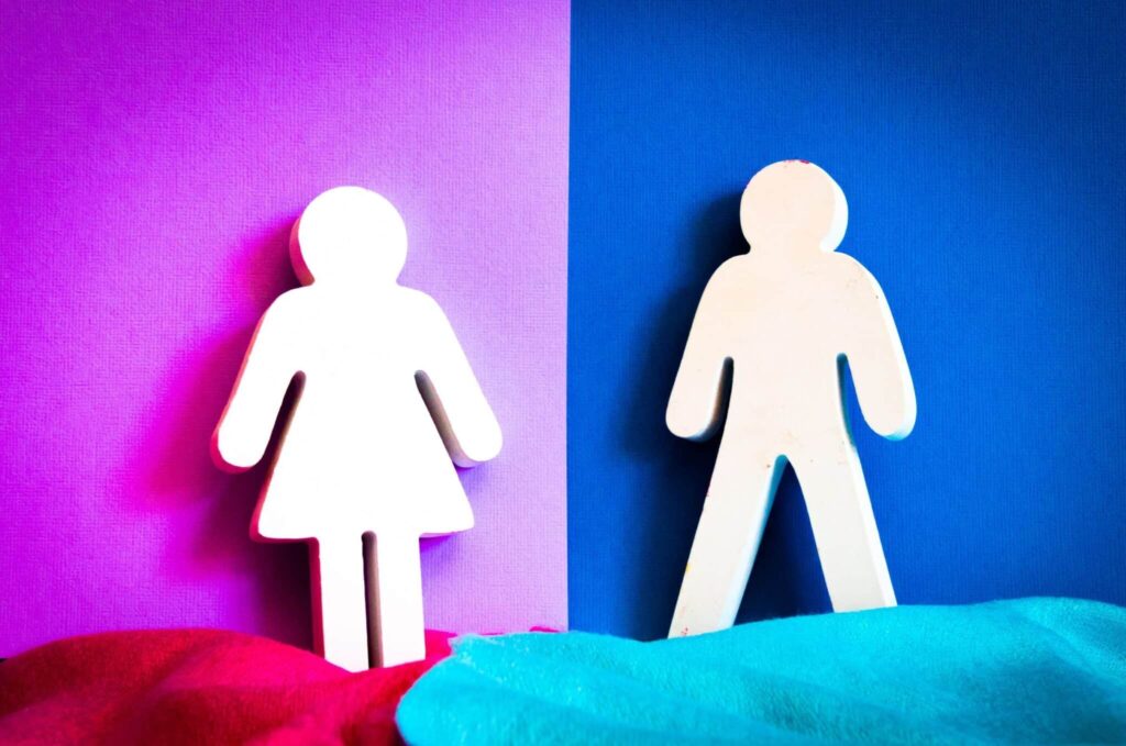
Gender and Colour
According to Kissmetrics, studies have shown that females preferred blues, purples and green the most, which were specifically: blue 35%, purple 23% and green 14%. Males, on the other hand, prefered Blue 57%, Green 14% and Red 7%.
Therefore, if you are trying to appeal to both sexes, a blue colour palette would be the strongest choice. Colours least liked for women are orange 33%, brown 20% and grey 17%. For men, they least liked brown 27%, orange, 22% and purple 22%. Females tend to gravitate more towards softer colours whilst men can prefer stronger bolder colours. If you use a colour palette with a dominant colour and softer hues, you can easily appeal to both genders.
So, How Can You Improve Your Marketing With a Better Use of Colour?
1 ) First, identify your brand characteristics and how you want to identify with your target audience.
2 ) After you have done this, then choose a colour palette that compliments these characteristics.
There is a lot more in-depth information available regarding the psychology of colour and we have discussed an overview of how colour psychology is helpful in marketing and branding. The power of using the right colour palettes can help you achieve an increased engagement and conversions in your marketing.
As we enter the new decade, it may be time to revisit your current colour palettes and see if a small tweak, or even a major overhaul, could boost your 2024 earnings.


